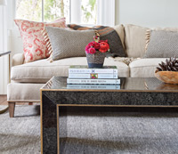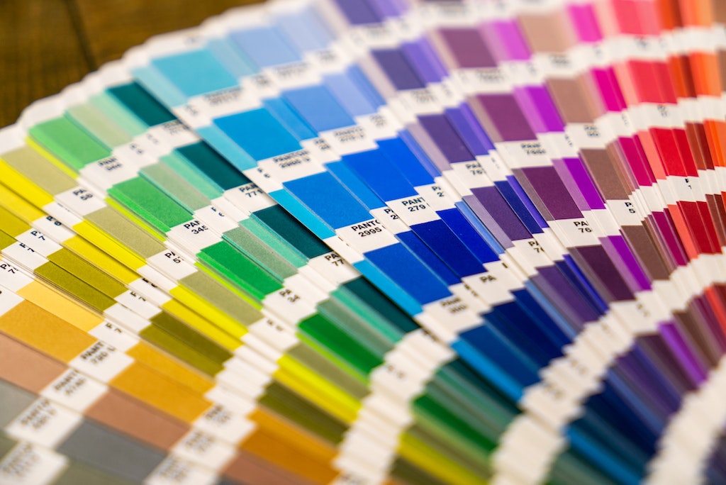
For nearly 60 years, Pantone has been a household name in the color world — an authority on the colors that will be most popular in fashion, home decor, product designs, and more. By constantly adding and systematizing new shades, Pantone has revolutionized the way we approach color. We surround ourselves with color in our homes and each specific hue conveys an idea, mood, or feeling that can set the tone of our lives.
Since 2000, Pantone has been selecting a “color of the year” and this fun tradition is one that we look forward to seeing every December. If you want to add some color to your home, but aren’t sure where to start, take inspiration from Pantone’s best colors over the years.

2019: Living Coral
Coral is a stylish and refreshing color that has been around for a while, but only recently due to Pantone is it getting its due. This bright coral shade is often used to evoke a coastal feel and represents the joyous spirit of summer. If you want to add Living Coral to your home, keep in mind that it looks beautiful when paired with a touch of aquamarine or blue. We use coral the most with accent pieces like our Makena pillow and Ginger Coral Organic Sham.

2016: Serenity
A soft blue, Serenity is a dreamy color that would bring peace and tranquility to any home. When paired with grey, Serenity creates a soothing palette that’s suitable for bedrooms, yoga studios, home offices, and other spaces that require calmness. Serenity works particularly well with light wood and other shades of blue – take a look at our Ombre Wood Bead Chandelier to see for yourself
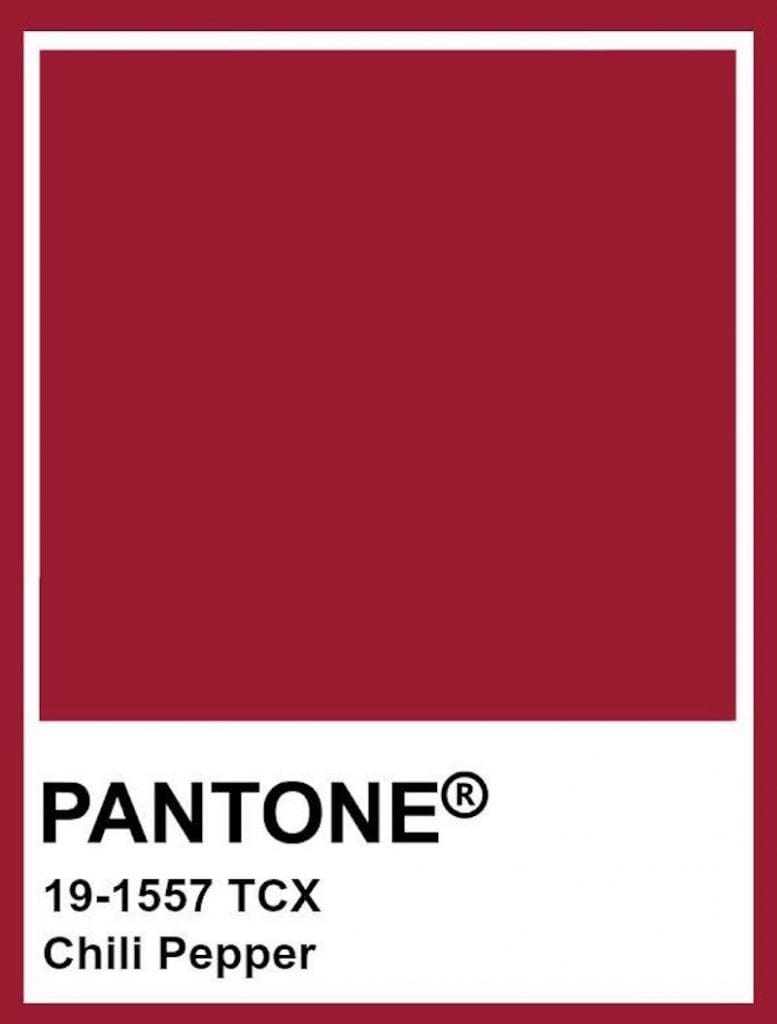
2007: Chili Pepper
It probably shouldn’t be used everywhere in your home, but when used correctly, Chili Pepper makes a bold and spicy statement. This vibrant Pantone color was a smash in 2007 and its ability to stir up a passionate response still holds true today. For this reason, it works best in small doses in a home, rather than as a wall color. For example, you can drape our Sahati Throw over the back of your sofa for a punch of color or add a one-of-a-kind antique Persian rug to your living or dining room.

2006: Sand Dollar
This light tan hue is associated with relaxation and nature. It’s a wonderful neutral that can be used in multiple rooms throughout the home, serving as a foundation from which to layer bolder colors. As the tone recalls the image of a sand dollar or sandy beaches, it’s particularly suited to coastal homes in Charleston. You can use Sand Dollar liberally in your home – from walls to upholstery – without ever getting tired of this subtle shade.
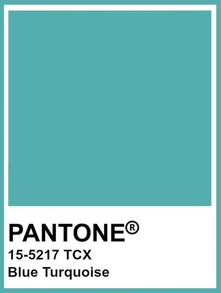
2005: Blue Turquoise
Ever been to a tropical paradise and fallen in love with its color? That’s what inspired designers at Pantone to come up with Blue Turquoise, a hue that perfectly represents leisure time by the pool. For those, like us, who appreciate a coastal color palette, try pairing Blue Turquoise accents, like our Catalina Glass Table Lamp with Living Coral. Of course, Blue Turquoise also works well with neutrals like Sand Dollar.
Let Us Help You Pick Your Colors at our Charleston Furniture Stores
It’s not easy picking out colors for your home, but it’s a lot less challenging when you ask our professional team of interior designers to help. At our Charleston furniture stores, you can work with one of our designers to select color palettes based on your home style and tastes. From there, you’ll have access to all sorts of combinations for upholstery, furniture, rugs, etc. before you commit. We’re here to assist you with every step in your home journey, so stop by to get started on your colorful project today.
Shop the Look

Catalina Glass Table Lamp
Translucent blue glass of the Catalina glass table lamp, evokes luminous and tranquility. Complimented with an natural linen drum shade and fitted polish nickel hardware to complete the coastal look.

Makena pillow
This giraffe inspired throw pillow is rich in color with a depht ranging from a mute orange to a deep burnt orange. A perfect pop of color in any living room.
